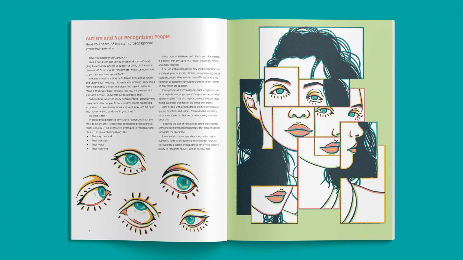
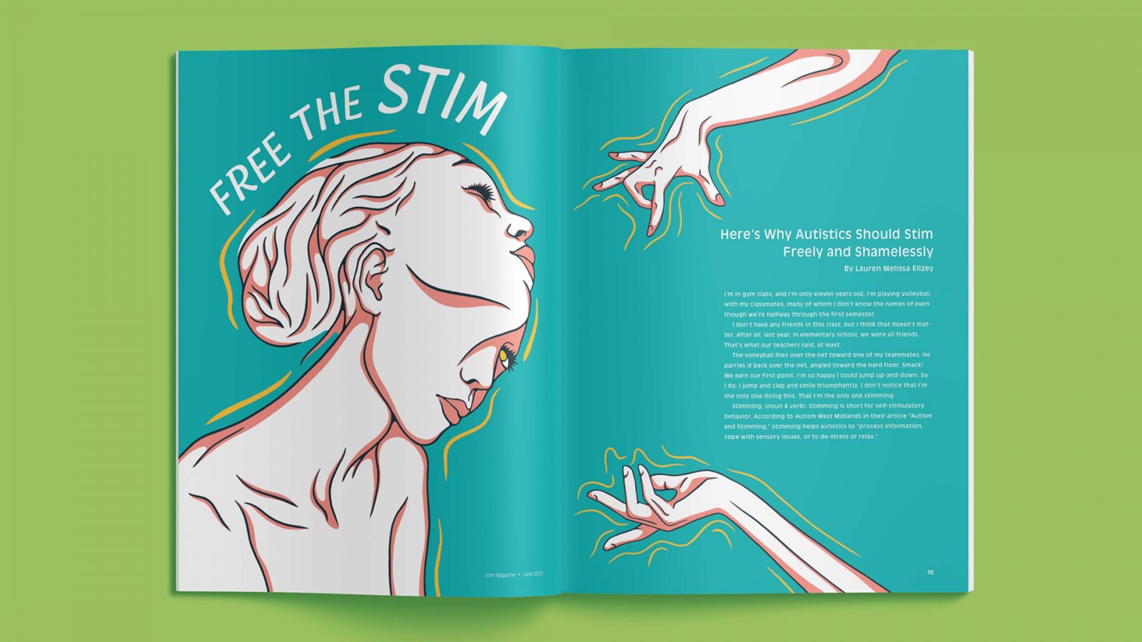
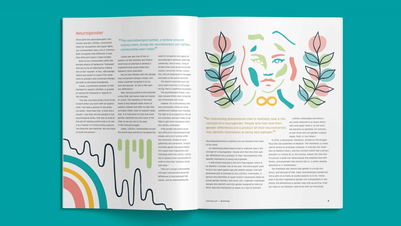
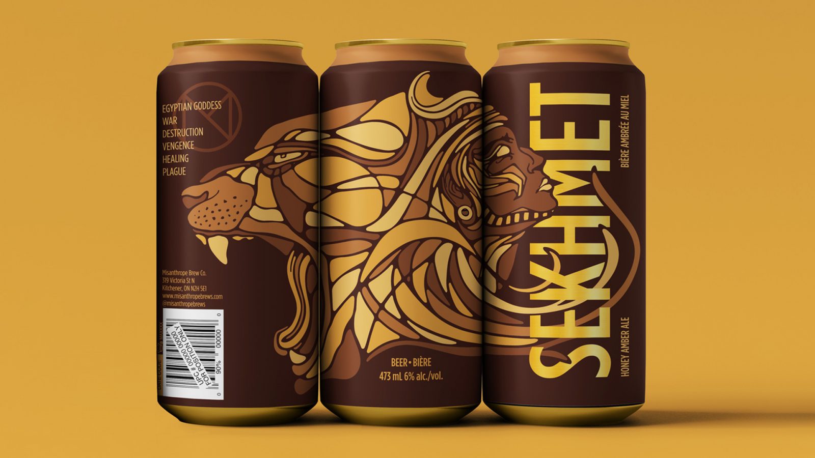
Hannah Gilbert

Hannah
Gilbert

Hannah is a versatile graphic design who has a passion for illustration, packaging, branding, and storytelling. She brings a unique perspective to every project she works on and is always willing to learn. She is detail-oriented, a quick learner, and a strong communicator.
Website
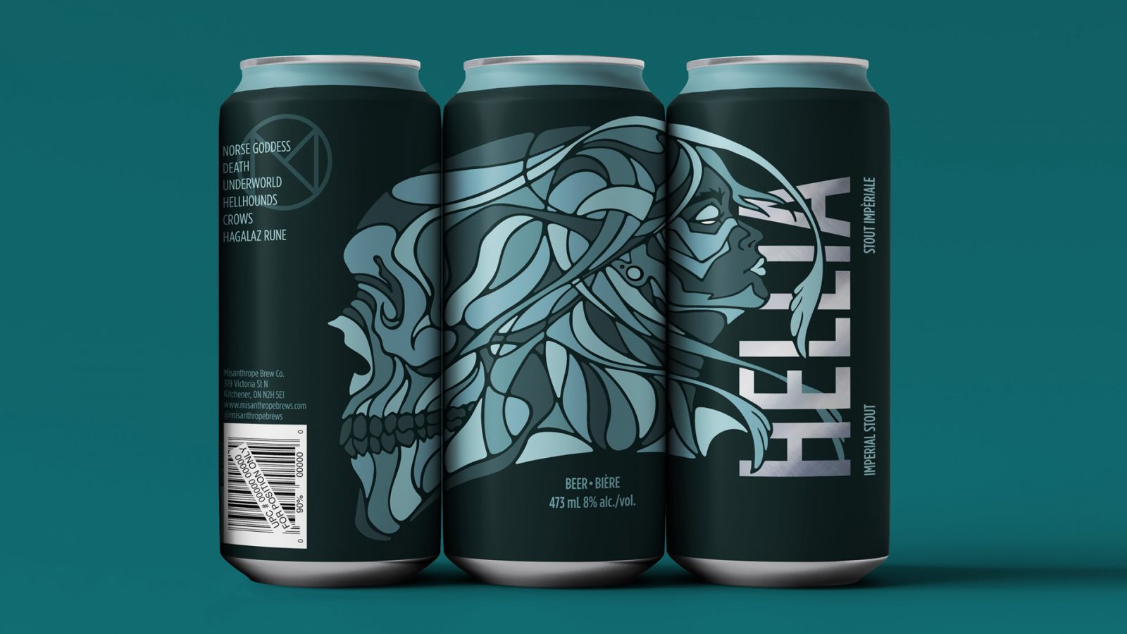
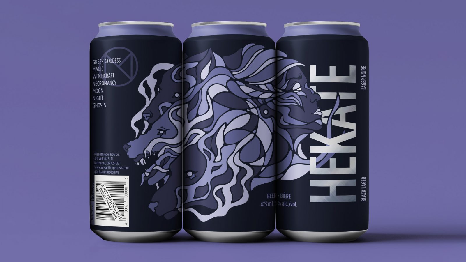
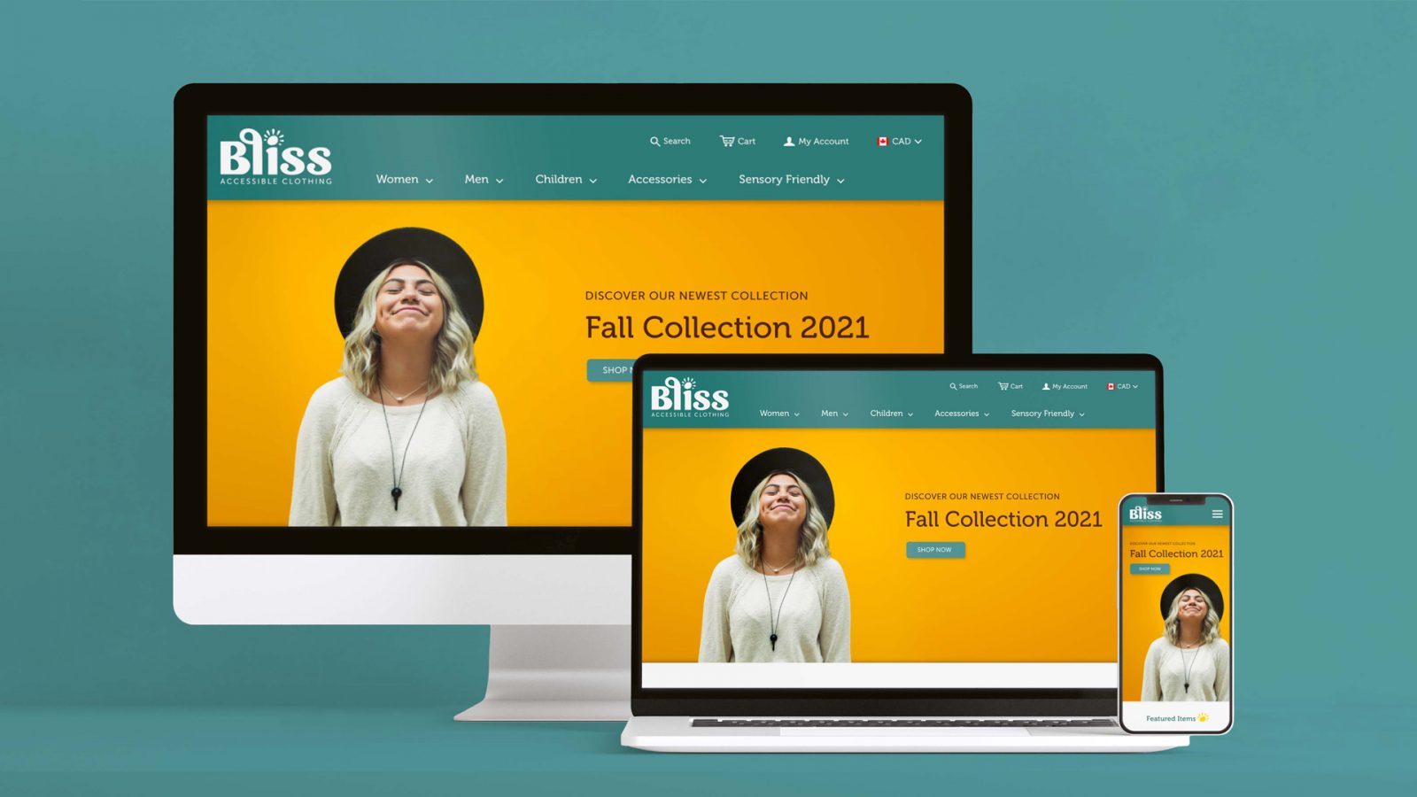
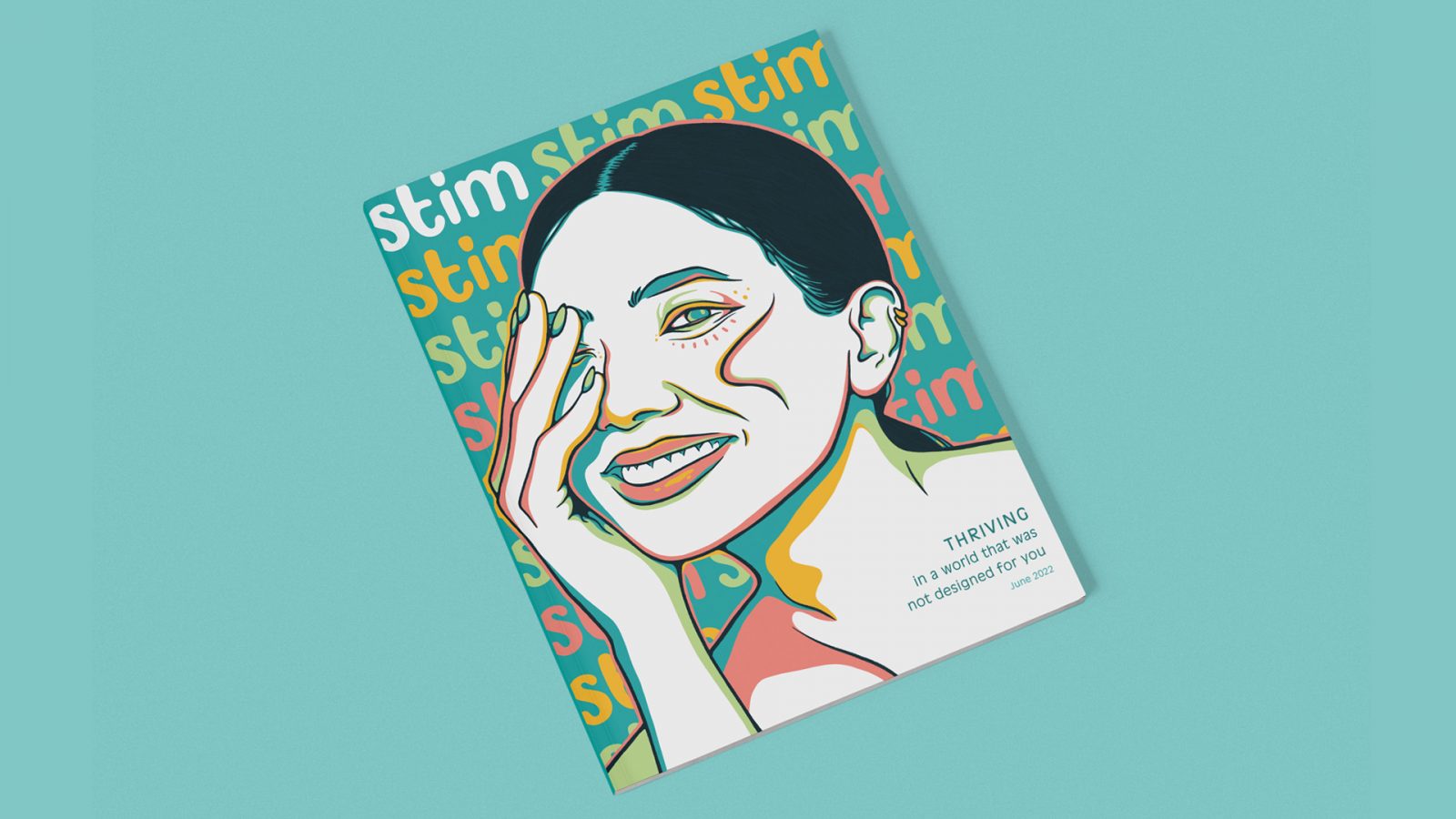
Bliss is an accessible clothing brand. A desktop Mac, a laptop, and a smartphone display the home page of Bliss’s website. The Bliss logo is in the top left corner of the screens and is white against the teal menu bar. The logo uses rounded, organic type and a sun icon replaces the dot in the “I” for the word ‘Bliss.’ Beneath, in a spaced out, sans serif font, are the words ‘accessible clothing.’ The teal menu bar features the main categories that can be shopped for in the store: Women, men, children, accessories, and sensory friendly. The website’s hero image features a photo of a young women with blond hair and a dark, round hat looking upwards with closed eyes and a smile. Her image is placed on the left half of the screen against a golden yellow background. On the right side there is left aligned type in dark brown that says “Discover Our Newest Collection: Fall Collection 2021.” Below is a rounded button in teal that says “Shop Now.” The desktop Mac, laptop, and smartphone all show this same page, sized accordingly to their aspect ratios. Stim Magazine explores the autistic experience. Stim aims to illustrate the unique parts of autistic neurology and celebrate neurodiversity. Stim Magazine’s cover features an illustration of a women’s portrait from a three-quarter view with her hand covering her far eye. Clean, dark blue line work is used to illustrate the women’s features. Four additional colours are used within the illustration: salmon pink, golden yellow, light green, and peacock blue. The colouring style is unique, using solid swathes of the contrasting colours side-by-side to create depth and interest. The coloured details cluster around the women’s most prominent features (eyes, nose, lips, etc.) as well as in areas cast into shadow. The rest of the illustration remains white. The background is peacock blue. Stim’s logo type is repeated in the background, three across the top, nine down the sides. The logo itself is lowercase type with organic, rounded forms. The top left logo type is white, different from the other logo type that repeats in a regular pattern of salmon pink, golden yellow, and light green. Dark peacock blue text in the bottom right corner within the women’s shoulder and neck reads: Thriving in a world that was not designed for you, June 2022. An example of a spread featured in Stim Magazine. This one page article titled “Autism and Not Recognizing People” briefly explores the connection between prosopagnosia, also called face blindness, and autism. One the lefthand page, the article title is left-aligned and coloured salmon pink. Beneath is the subtitle “Have you heard of the term prosopagnosia?” and the author byline. The article content is broken into two columns and fills the top half of the page. Beneath is an illustration of five eyes. The eyes are outlined with dark blue line work and coloured with salmon pink, golden yellow, light green, and peacock blue. The colouring style is similar to the cover page with the four contrasting colours highlighting the areas in shadow. Each of the irises are coloured peacock blue with a slightly darker blue pupil and light green highlights. The righthand page features a full page illustration of a women’s face fractured into pieces. Multiple rectangles overlap each other, displaying different facial features to form the vague, broken-up images of faces to represent the experience of prosopagnosia. The line work is dark blue and the colouring is done with the same palette of salmon pink, golden yellow, light green, and peacock blue. The illustration is less detailed than the cover and features more whitespace. Outside the overlapping rectangles, the background is light green. The magazine spread mockup is placed onto a peacock blue background. An example of a spread featured in Stim Magazine. This article titled “Free The Stim” encompasses two spreads, though only one is shown in the image. The lefthand page features an illustration of a women with two faces. The women is turned at a three-quarter view towards the centre of the spread. One of her faces is turned to look at the viewer while the other head stretches from her face to look up and out, creating an optical illusion, like a film captured between two transition frames. The women’s features are illustrated with dark blue line work, the shadowed areas coloured in salmon pink. Yellow lines follow the curvature of the women’s face, hair and neck, capturing her movement. The article title “Free The Stim” curves around the top of the women’s head. The righthand page features two illustrations of hands that frame the article text. The article subtitle “Here’s Why Autistics Should Stim Freely and Shamelessly” and the author by line are right aligned against the right side of the page. Three paragraphs of the article text begin below. This chunk of text is vertically centred. The two hands that surround the text come one from the top of the page and one from the bottom. The fingers and wrists of these hands are bent in different positions to showcase the movement of stimming. The hands are rendered in the same style as the women from the lefthand page. The magazine spread mockup is placed onto a light green background. An example of a spread featured in Stim Magazine. This is the third and final spread in the article titled “Double Rainbows: Sexual Orientation, Gender Identity, and Neurodiversity.” The subtitle appearing in the top left corner of the lefthand side of the spread and coloured salmon pink is “Neurogender.” The article text is arranged into three columns. A top the the two right most columns sits a pull quote in peacock blue. In the bottom left corner there is an abstract illustration. The illustration features a small rainbow in salmon pink, golden yellow, and peacock blue in the left bottom portion. A dark blue, squiggly line that looks like a heartbeat or a brain wave reaches from the left side of the page down to the bottom. In the right top corner of the illustration are six rounded lines of various lengths in light green. The article text continues in two columns on the bottom half of the righthand page. Another pull quote is placed within the columns of text in dark golden yellow, stretching from the left column and into the right. The top half of the righthand page features an abstract illustration of a women’s face surrounded by two branches of leaves. Different organic shapes coloured in salmon pink, light green, and peacock blue make up the women’s face. A yellow infinity sign sits in the centre of the women’s neck. The branches of leaves, lined in dark blue, are mirrored on either side of the women’s face. Blobs of salmon pink, light green, and peacock blue are placed behind each leaf with lowered opacity. The magazine spread mockup is placed onto a peacock blue background. A set of three beer cans placed side-by-side display a design based off of Sekhmet, the Egyptian Goddess of war and healing. An illustration spreads across the surface of the can depicting the goddess’s face and a lion’s face amid swirling, interconnecting lines. The illustration uses dark brown line work and is coloured similarly to a mosaic in two shades of yellow and two shades of brown. Large sans serif type that reads “Sekhmet” is stacked vertically and intertwined with the design. The golden metal of the can shines through the type. The background is dark brown with a tan ring along the top of the can. Misanthrope’s brand logo is placed above and to the left of the illustrated lion’s head. The logo is a customized ‘M’ within a circle, coloured brown to match the can’s design. Left aligned text overlays the logo in yellow, listing six traits associated with the goddess: Egyptian goddess, war, destruction, vengeance, healing, and plague. The three cans are displayed against a golden yellow background. A set of three beer cans placed side-by-side display a design based off of Hellia, or Hel, the Norse Goddess of the underworld. An illustration spreads across the surface of the can depicting the goddess’s face and a skull amid swirling, interconnecting lines. The illustration uses dark teal line work and is coloured similarly to a mosaic in four varying shades of turquoise. Large sans serif type that reads “Hellia” is stacked vertically and intertwined with the design. The silver metal of the can shines through the type. The background is dark teal with a light turquoise ring along the top of the can. Misanthrope’s brand logo is placed above and to the left of the illustrated skull. The logo is a customized ‘M’ within a circle, coloured teal to match the can’s design. Left aligned text overlays the logo in light turquoise, listing six words associated with the goddess: Norse goddess, death, underworld, hellhounds, crows, Hagalaz rune. The three cans are displayed against a teal background. A set of three beer cans placed side-by-side display a design based off of Hekate, the Greek Goddess of the crossroads and witchcraft. An illustration spreads across the surface of the can depicting the goddess’s face and the faces of three wild dogs amid swirling, interconnecting lines. The illustration uses dark plum line work and is coloured similarly to a mosaic in four varying shades of blueish-purple. Large sans serif type that reads “Hekate” is stacked vertically and intertwined with the design. The silver metal of the can shines through the type. The background is dark plum with a light blueish-purple ring along the top of the can. Misanthrope’s brand logo is placed above and to the left of the illustrated dog heads. The logo is a customized ‘M’ within a circle, coloured dark purple to match the can’s design. Left aligned text overlays the logo in light purple, listing six words associated with the goddess: Greek Goddess, magic, witchcraft, necromancy, moon, night, and ghosts. The three cans are displayed against a blueish-purple background.