Maya
McFarlane
2025
Maya McFarlane is passionate about design, photography, and nature, with a deep interest in packaging and illustration. She has collaborated with organizations like Positive Living Niagara, Waterloo Wellington Self-Management Program, and THEMUSEUM on marketing materials and logos. She hopes to secure a graphic design role in nature conservation.

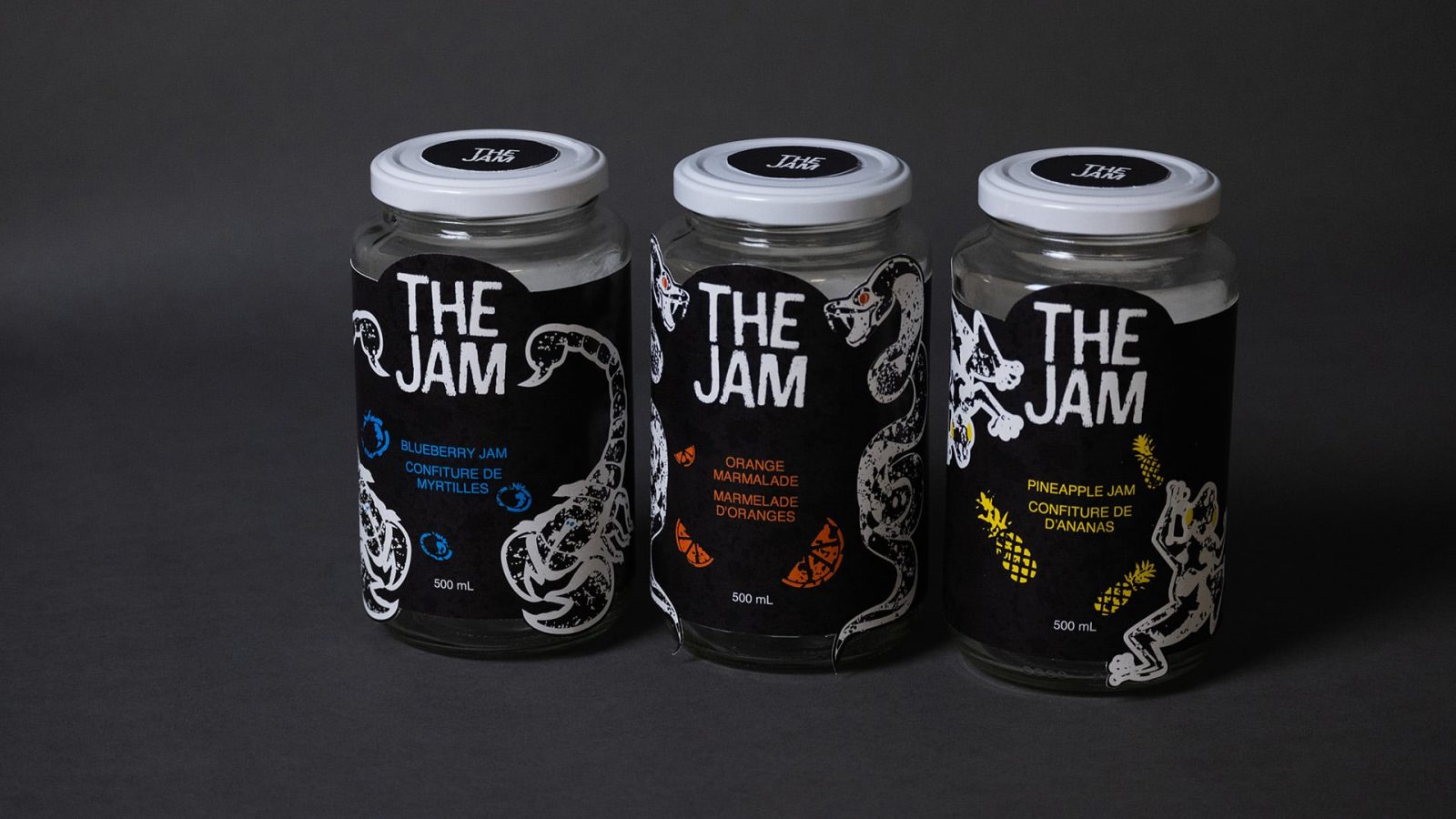
The Jam symbolizes the hardships of adulting and the turbulence one may have in doing so. Featuring a rough texture in the background versus the typical brightly coloured jams marketed as cheerful, the only bright colours are used sparingly, too. These colours are chosen as they contrast the dark background and correlate to three animals: a viper, a scorpion, and a poison dart frog. The reason for that is these animals are poisonous, foreshadowing adulting hardships.

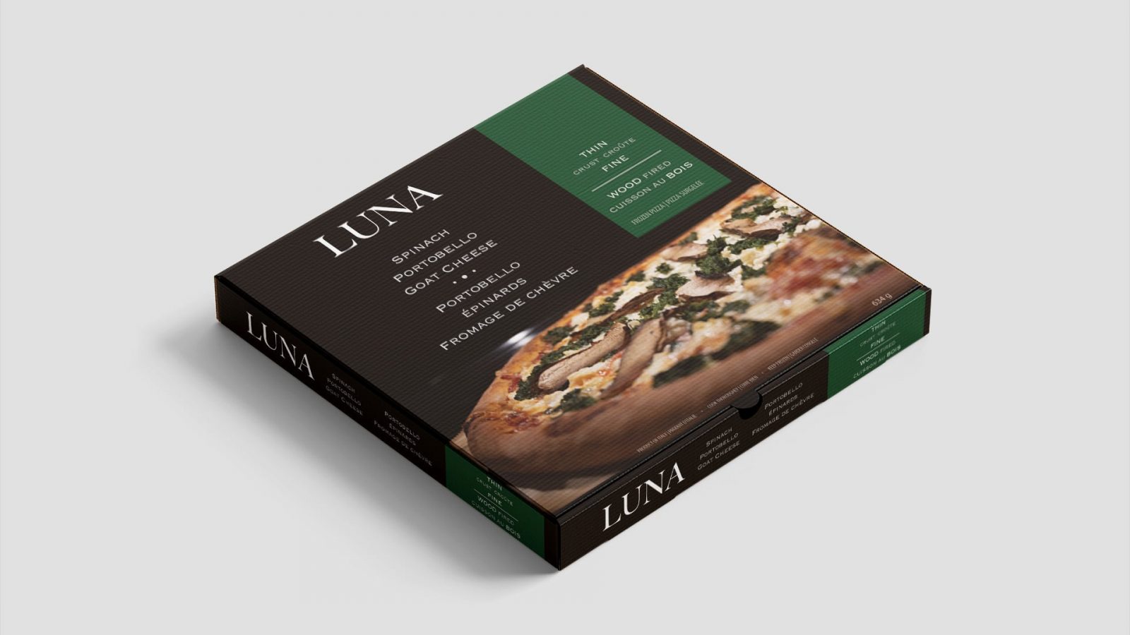
Luna is an authentic, high-quality Italian, thin-crust, wood-fired pizza. When one thinks of this type of pizza, one will likely imagine a refined typographic solution using a serifed typeface. This pizza box features just that, providing what is expected in both terms of design—and flavour. Rich colours are used, most notably a deep green for the banner which carries the pizza details. On the back panel, a photo of half a pizza is used, sending the brand name “Luna” home as it looks like a crescent moon.