Tiffney Latendresse

Tiffney
Latendresse

Tiffney is a graphic designer who is passionate about editorial design, packaging design, photography, and illustration. She also enjoys learning new skills to expand her design capabilities. Tiffney is a hard worker who understands how to balance a busy schedule.
Website
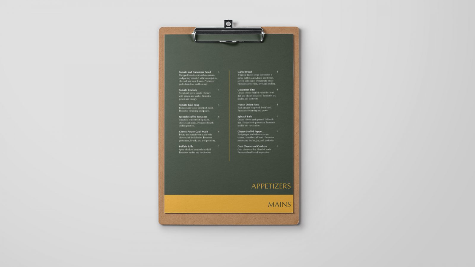
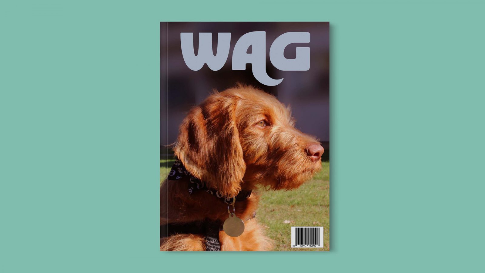
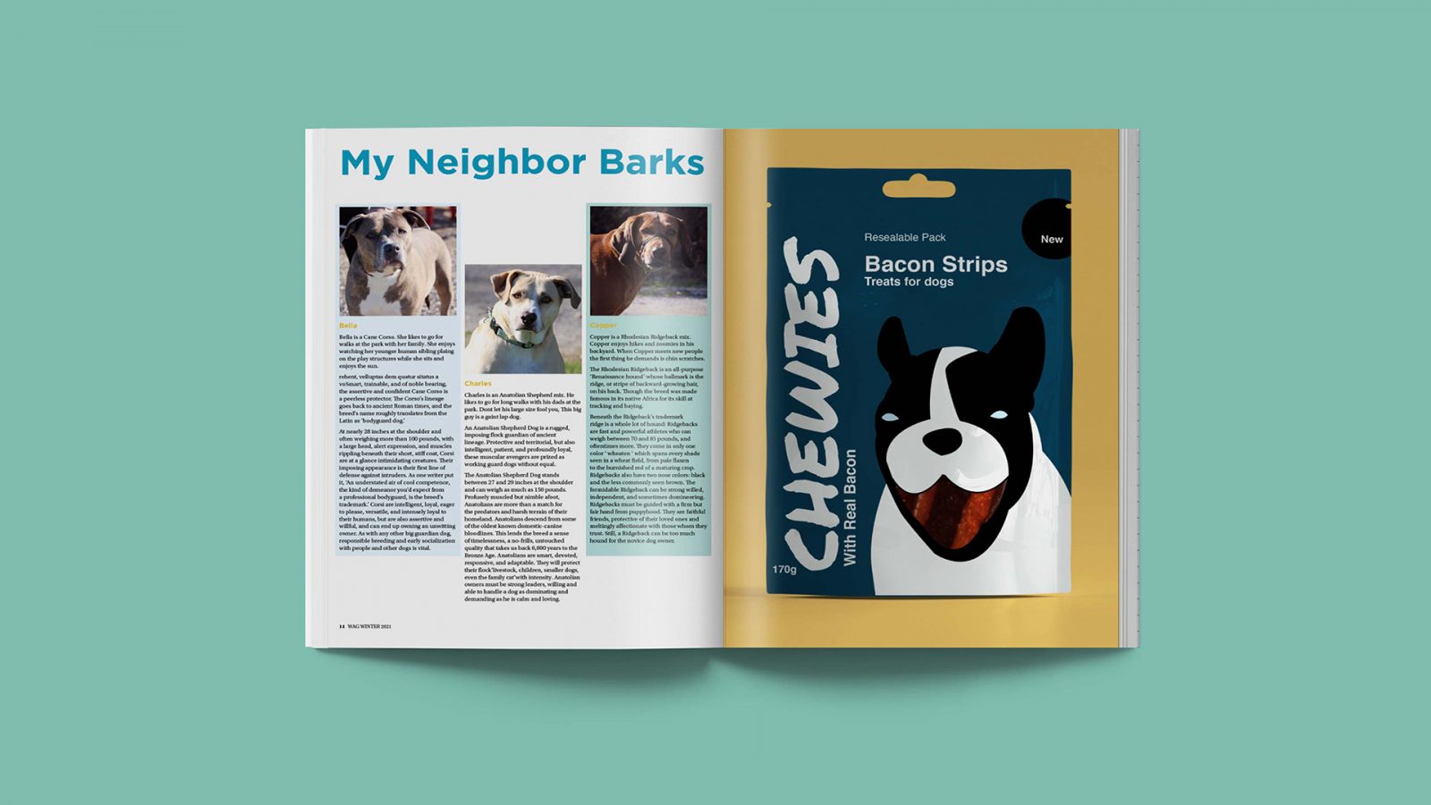
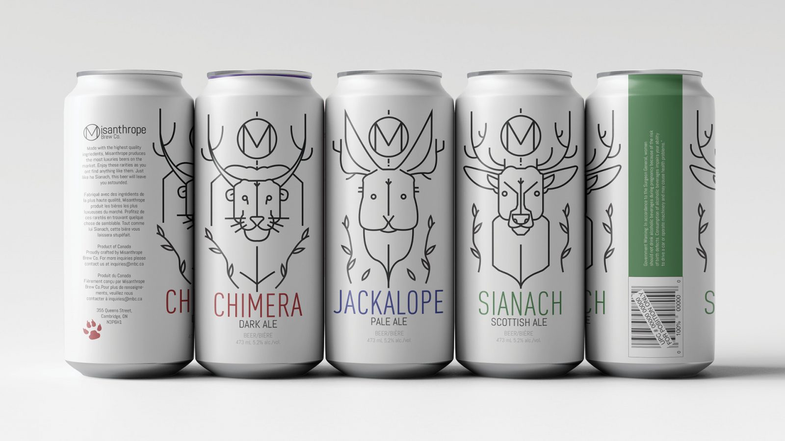
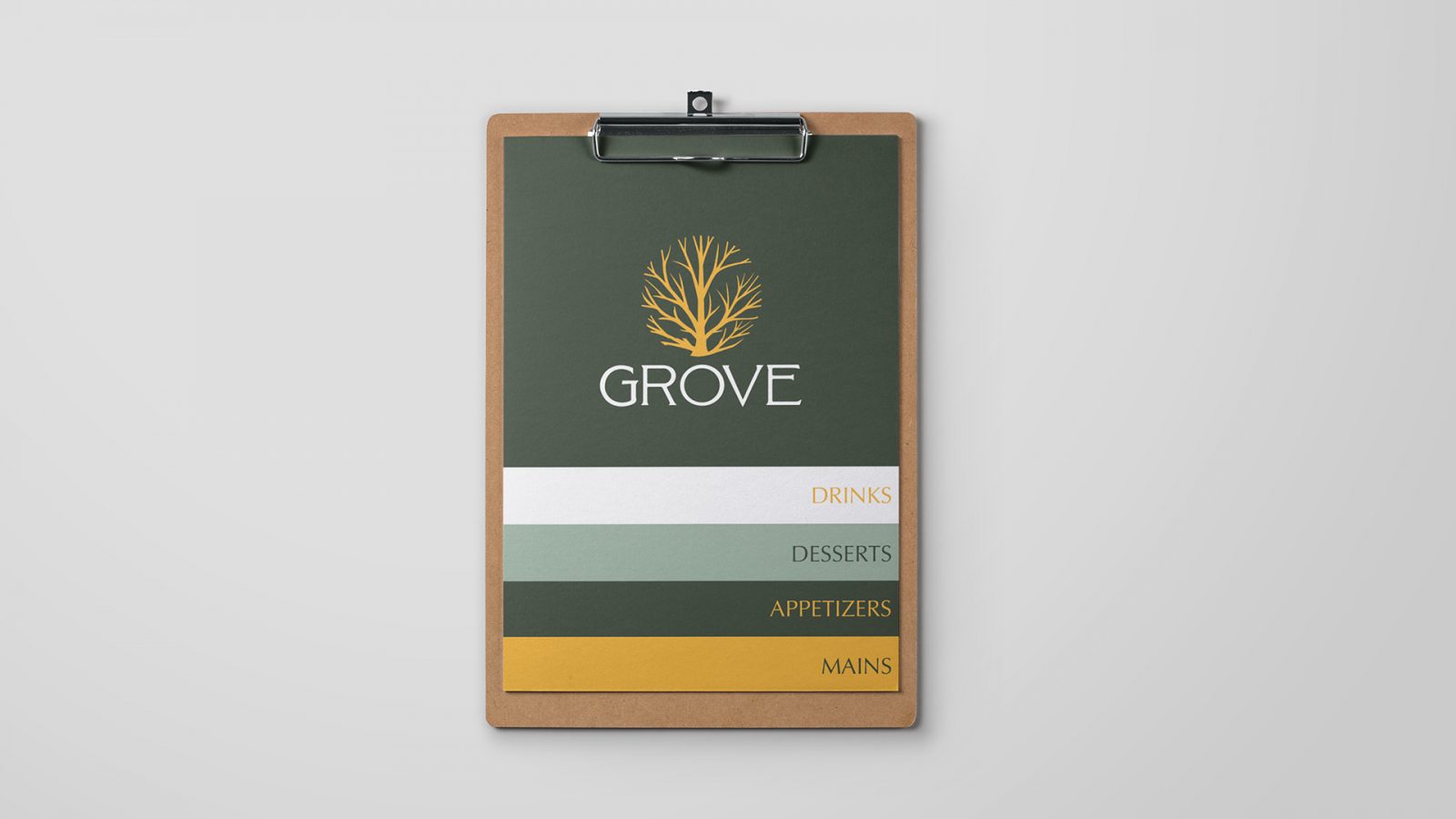
Three beer can designs. From left to right it is Chimera, Jackalope, and Sianach. Chimera is a dark ale with an illustration of a mythical creature that looks like a lion with large horns. Jackalope is a pale ale with an illustration of a mythical creature that looks like a rabbit with antlers. Sianach is a Scottish ale with an illustration of a mythical creature that resembles a deer with glowing eyes and hooves. The illustration style for the creatures are done with black, mono-weight lines on a white background. The product names are in colours: “chimera” is red; “jackalope” is blue; and “sianach” is green. Grove restaurant menu has the Grove logo – a circular tree icon that is golden yellow, under the tree icon is the word Grove in white. The menu is made up of five overlapping layers. The pages gradually get shorter the closer to the top they are allowing the title from the page below to show. The top page is a dark green with the logo centred. The second page is white with the title on the bottom right in golden yellow. The title is drinks. The third page is light green with the title on the bottom right in dark green. The title is desserts. The fourth page is dark green with the title on the bottom right in golden yellow. The title is appetizers. The fifth page is golden yellow with the title on the bottom right in dark green. The title is mains. All these pages are held together with a clipboard. Bottom two pages of Grove restaurant menu. The top page is slightly shorter than the bottom allowing the headers to show. The first page is dark green with the title on the bottom right in golden yellow. The title is appetizers. The page is 2 columns wide and has a line down the centre. The second page is golden yellow with the title on the bottom right in dark green. The title is mains. All these pages are held together with a clipboard. The cover for Wag magazine. The Wag logo is a pale blue. The logo is designed with a thicker sans serif font. The bottom right corner of the letter “A” stretches down into a tail shape. The cover image is a red labradoodle facing towards the right. There is a barcode on the bottom left. A spread from Wag magazine. The left page title is “My Neighbor Barks” The article consists of three columns with an image of a different dog at the top of each column. The text explains the details about the dogs photographed. The right page is an ad for Chewies bacon strips. The package has a large illustration of a dog. Tiffney Latendresse portrait